Helping Young Adults Start Their Investment Journey

YEAR
2021
ROLE
Sole Designer
TIMELINE
6 Months
Many young people know they should be investing, but the learning curve is steep. Complex terms, cluttered interfaces, and the fear of making a costly mistake can stop them before they begin.
StockUp is a concept for a mobile app designed to change that. It provides approachable financial education with simplified investing tools so users can build confidence as they grow their portfolios. With bite-sized lessons, intuitive trading features, and a visual, gamified interface, StockUp turns financial literacy into something rewarding and fun.
This was a solo UX/UI project where I led the 0 → 1 process—from research and user flows to branding, high-fidelity mockups, and interactive prototyping. I focused on clarity, motivation, and reducing the emotional friction often tied to financial decisions.
Designing for Learning and Action
Education is only half the battle when it comes to investing; users also need safe, easy ways to apply what they learn. StockUp’s challenge was to balance encouragement with practical tools, helping users take meaningful action without feeling overwhelmed.
My goal was to support users at any stage of their journey: whether they were just exploring the stock market or ready to make their first investment.

High Level Goals
01
Make investing approachable
02
Combine learning and trading tools in one
Consumer Research & Competitive Study
To understand the space StockUp would enter, I explored popular investing and budgeting apps like Robinhood, Acorns, Mint, and Stash. Many excelled at onboarding and encouraging beginner-friendly investing but lacked flexibility in how users could learn.
I also interviewed several young adults curious about investing but unsure where to begin. Their feedback revealed common pain points:
• Overuse of jargon and financial “gatekeeping”
• Confusing app flows and bloated dashboards
• Fear of making irreversible mistakes
These insights guided StockUp’s core approach: offer friendly education, a clear structure, and gentle guidance without ever talking down to the user.

User Interviews
I interviewed some members of the target audience to get a better idea of where they were in their investment journey. This helped me uncover frustrations, goals, and habits that I wouldn’t have assumed on my own.
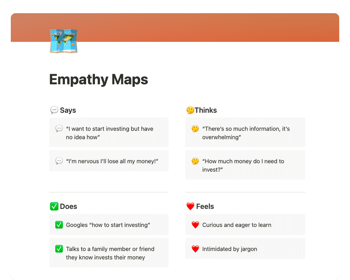
Creating Empathy Maps
After interviewing users, I built out empathy maps to visualize user emotions, thoughts, and behaviors. This helped me build a more intuitive experience that meets users’ needs.
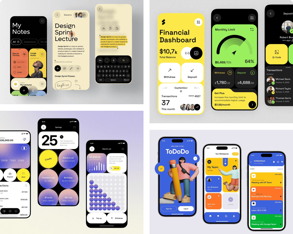
Mood Board
I curated visual references to define a clean, approachable look and guide the app’s overall style.

Wireframing
I started with sketches on my iPad. This allowed me to test different layouts to fit the education and trade portions of the app, making sure everything felt cohesive.
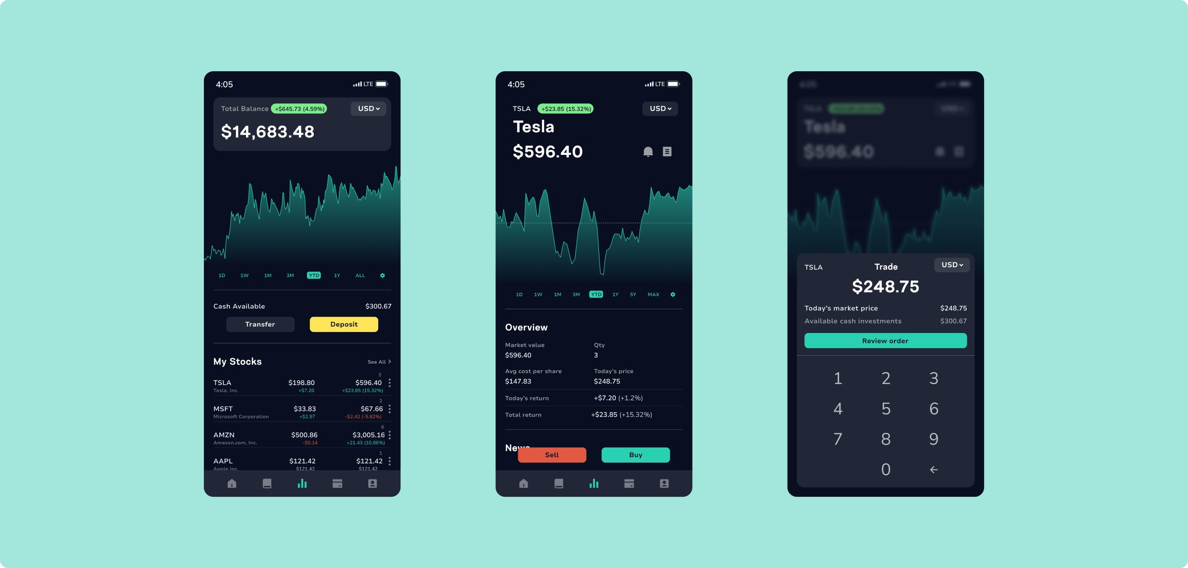
A Friendly Guide to the Stock Market
The Learn section offers bite-sized lessons, videos, market updates, and interactive quizzes. It’s designed to be motivating, not overwhelming, so learning about finance feels less like studying and more like leveling up.

Go from Learning to Earning
In the Invest section, users trade with simplified tools and receive nudges based on their learning progress, bridging the gap between education and action.
Visual Design That Motivates
StockUp needed to feel trustworthy and exciting—something that could earn users’ attention in a crowded, often sterile market.
I created a bold, optimistic brand using colors tied to speed and financial growth—red, yellow, and green—alongside a logo inspired by line charts and upward movement. The visual system uses geometric illustrations and a bright, cartoon-influenced style that makes abstract financial concepts feel tangible.
Typography and layouts emphasize accessibility, while microinteractions guide users without overwhelming them. From learning to trading, the design keeps things clear, fun, and focused.

Beyond the App
To bring the brand to life outside the screen, I created a suite of supporting assets including email templates, welcome kits, tote bags, and collectible keychains. These physical touchpoints reflect StockUp’s voice and support community-building as the product grows.


Reflection
Designing StockUp showed me how effective UX can break down functional and psychological barriers. The biggest user wins came from clarity, pacing, and tone: simplifying trade flows, reinforcing learning through progress markers, and making the language friendly without feeling juvenile. It also helped me think more deeply about motivation. People want to learn and grow but they need systems that trust them to try, and designs that guide them without pressure. Even though this was a concept project, the real user feedback made it stronger at every step.