Streamlining Healthcare Clinic Check-ins

YEAR
2025
ROLE
Sole Designer
TIMELINE
4 Weeks
MY RESPONSIBILITIES
User Research, User Flows, Wireframing, Visual Design, Prototyping, Usability Testing
Modern healthcare often relies on outdated workflows: long paper forms, clipboards at the front desk, and repetitive data entry. These inefficiencies create privacy concerns, cause delays, and put unnecessary strain on both patients and staff.
Chrona is a mobile check-in concept designed to give patients more control over their care while freeing up front desk staff to focus on people rather than paperwork. This was a 4-week solo project completed as part of a UX course, where I led the entire process from problem definition to high-fidelity prototype.
Project Goals
Check-ins affect everyone who steps through a clinic door. Patients face long waits, confusing paperwork, and the discomfort of repeating sensitive information. Front desk staff juggle data entry, insurance verification, and lines of frustrated people. I wanted to improve the experience for both sides.

Understanding the Context
To understand the space Chrona would enter, I scanned tools from urgent care kiosks to portals like MyChart. Many relied on static forms and login friction, often ignoring edge cases like tech-anxious seniors, late arrivals, or parents juggling multiple check-ins. I saw a chance for Chrona to stand out through proactive communication, clearer task breakdowns, and support for real-world scenarios.
Designing the Solution

Personas
I created three core personas to represent patients, administrative staff, and doctors that may use this app. This exercise revealed user needs, goals, and behaviors which helped guide design decisions along the way.

Mapping User Flows
I created flows for three core scenarios: early check-in, day-of arrival, and follow-up visits. These flows needed to account for real-life interruptions like saving forms for later or skipping insurance updates when nothing had changed.

From Sketches to Wireframes
I started with rough paper sketches to work through screen-level logic before moving to mid-fidelity wireframes in Figma. This let me test layout rhythm and information hierarchy early, making sure the check-in process felt linear and manageable, not overwhelming.

Visual Design
Once the structure felt solid, I developed a clean, accessible visual system. I prioritized readability, generous whitespace, and clear CTAs to reduce cognitive load, especially important when users are filling out sensitive health information on their phones.
Testing & Refinement
With a clickable prototype built, I conducted usability testing with five family members. I gave each person realistic tasks like "check in for tomorrow's appointment" and "update your insurance information" and observed how they navigated the app.

What I Learned
Tap targets needed to be larger
Older participants struggled with precision on mobile. I increased button heights from 44px to 56px and added more spacing around interactive elements.
Users wanted reassurance about saving progress
Multiple testers hesitated before leaving a partially completed form. I added an auto-save indicator ("Draft saved") to provide confidence they wouldn't lose their work.
The progress bar reduced anxiety
Participants appreciated knowing how many steps remained. One tester said, "I didn't feel trapped… I could see the end." This validated the segmented form approach.
Form language needed simplification
Medical terminology confused some users. I revised labels like "Primary Care Physician" to "Your Main Doctor" and added helper text where needed.
Conversations About Real Check-In Experiences
During testing, I also asked participants about their past experiences at clinics. Common frustrations included:
Filling out the same forms repeatedly
Not knowing how long they'd be waiting
Anxiety about privacy when discussing health info at the front desk
These insights reinforced the core problems Chrona was trying to solve and validated that the pain points I'd identified were widely felt.
Key Features
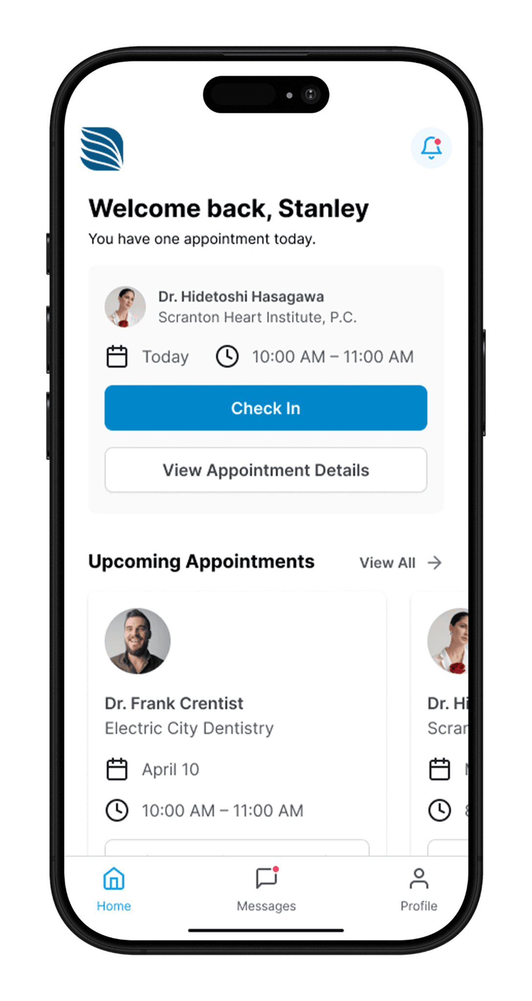
Easy Check-In
Complete your check-in from your phone before you arrive, or at your own pace when you have time. No more clipboards in the waiting room.
Secure Health Information
Import your medical history from your provider’s portal or fill it out manually. You stay in control and can update details anytime.
Smart Appointment Tracking
See exactly where you are in the process from check-in to being called in. No more guessing how long you’ll wait.
QR Code Arrival
When you arrive at the clinic, simply scan a QR code to let staff know you're here. Avoid the lines, forms, and confusion.
All Your Medical Records in One Place
Build a consolidated health record that includes lab results, visit notes, and prescriptions. Keep full control over what you share and who you share it with.


Seamless In-App Communication
Connect with your doctor and care team through secure in-app messaging. Ask questions, request refills, or follow up on test results without playing phone tag.

Reflection
Designing Chrona reinforced how thoughtful UX can reduce real-world stress. The features that tested best (segmented forms, auto-save feedback, and QR check-in) were the ones that gave users clarity and control.
This project also pushed me to think system-wide. I had to consider HIPAA compliance, re-entry flows for returning patients, and the realities of overworked clinics serving diverse populations. Balancing empathy with logistical constraints became the core of every decision.
As I transition from graphic design to UX/UI and product design, Chrona represents my ability to think beyond aesthetics and design systems that solve real problems for real people.
What I'd Do Differently
Given more time and resources, I would:
Test with a more diverse group (different ages, tech comfort levels, and health conditions)
Explore integration with existing EHR systems like Epic or Cerner
Design a tablet or web version for broader accessibility
Conduct field research at actual clinics to observe check-in workflows in context
