Simplifying the path to orthopedic care for seniors
YEAR
2025
ROLE
UX/UI Designer
TIMELINE
June 2025–Now
MY RESPONSIBILITIES
User Research, User Flows, Wireframing, Visual Design, Prototyping, Usability Testing
Note: Site currently reflects July 2025 temporary fixes. Comprehensive redesign launching Q1 2026.
Cleveland Orthopedic & Spine Institute (COSI) is a physician-owned orthopedic clinic led by highly-regarded specialists. Despite strong reputations and clinical expertise, the practice was nearly invisible online, undermining credibility and limiting patient acquisition.
I led an iterative redesign to transform COSI's digital presence, starting with rapid UX validation and progressing toward a comprehensive site rebuild. Within seven months, new patient discovery more than doubled while the site climbed from page 3 to page 1 of search results.
+104%
New users from organic search
+145K
Search impressions
+11%
Mobile traffic
95%
Site health score
*These statistics only result from the first iteration of fixes made to the website, 07/25. The second iteration consisting of a comprehensive redesign with visual and content improvements is currently in final development.
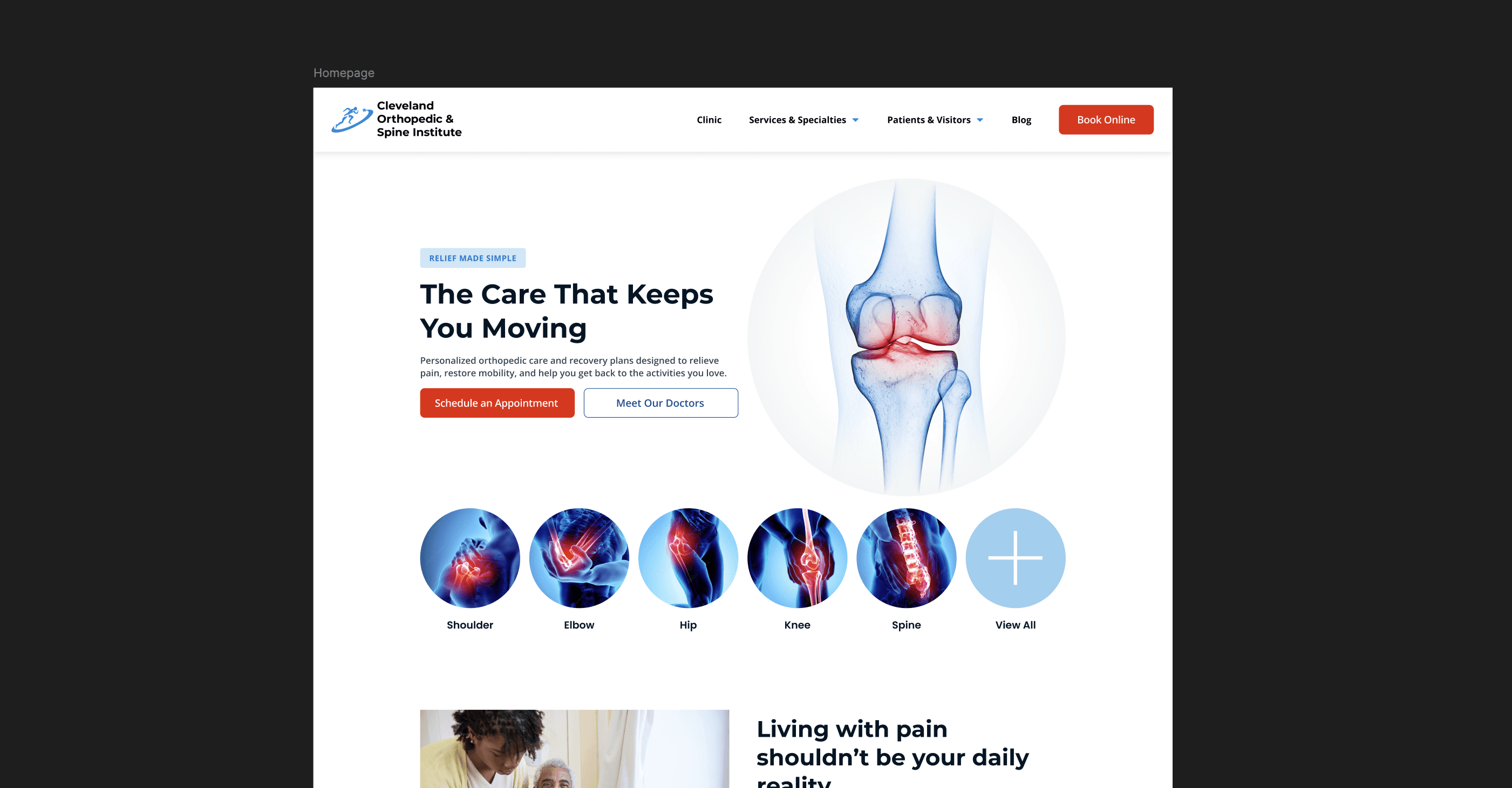
When Design Undermines Expertise
COSI’s physicians are recognized leaders in orthopedic care, but their website told a different story. Discovery was inconsistent for prospective patients, and the site did little to build confidence or provide clarity once users arrived. Because the clinic primarily serves seniors seeking orthopedic care and family members researching options for aging loved ones, this gap in professionalism and usability was especially damaging for a specialty practice.
Problem
Poor website usability and outdated design were making COSI invisible to patients and undermining credibility.
🕵 Discoverability: Site wasn’t ranking for relevant searches, patients couldn’t find COSI
🧭 Navigation: Confusing and long appointment scheduling process
📚 Content: Outdated info, missing key details, no compelling reason to choose COSI
🦮 Accessibility: Font sizes, contrast, alt text blocking senior patients from using the site effectively
❤️ Technical: Poor site health, performance issues
Stakeholder Insights
Conversations with front desk staff revealed pain points that analytics alone couldn't show. One receptionist explained: "Our main demographic is older patients who don't typically know what information is on the website. We get a lot of calls asking basic questions that could be answered online."
These insights validated that the website was creating real operational burden by failing to provide basic self-service information.

Strategy
Validate Before Building
To create immediate value for the clinic while laying the groundwork for a larger redesign, I proposed an iterative approach:
Phase 1: Implement targeted fixes to test core hypotheses and demonstrate ROI
Phase 2: Use validation data to inform comprehensive redesign priorities
Phase 3: Launch full rebuild with expanded content and advanced navigation
This approach would prove whether UX improvements could move the needle, justifying investment in the larger rebuild while delivering immediate patient value.
PHASE 1
Targeted Repairs
I prioritized changes that would immediately improve usability while testing whether better UX could drive patient discovery.

Redesigning the Appointment Scheduling Flow
The existing appointment process created unnecessary friction. When patients clicked the main call-to-action, they were directed to call the surgery center's phone number. Once connected, they'd be transferred to the clinic, then often transferred again to the appropriate physician's practice; a 12-step process with multiple drop-off points. Administrative staff spent much of their day redirecting misdirected calls.
I redesigned the experience to provide two clear paths: online scheduling for those who prefer self-service, and a direct phone line with a simplified tree routing callers correctly the first time. The online path reduced the process steps by 50%.
Early Impact
While quantitative data on call reduction isn't available yet, staff report fewer confused patients calling the wrong number. The online option also serves working caregivers scheduling for elderly parents, typically researching during work hours when calling isn't convenient. The new flow transformed a 12-step obstacle course into a straightforward 6-to-7-step process with more direct routing.

Building an Accessible Foundation
The site actively blocked its primary demographic, seniors with vision or mobility challenges, from accessing information. Body text was 14 pixels (below the 16 pixel standard), making it difficult to read. Low-contrast color combinations failed WCAG guidelines. Alt text repeated file names instead of describing images so screen readers announced "surgery-center-817-by-688-dot-jay-peg-gee" instead of meaningful descriptions. Interactive elements had no visual indicators of clickability without hovering, problematic for mobile users and older adults.
I increased text size to sixteen pixels, corrected contrast ratios throughout, and rewrote all alt text to be descriptive. The heading hierarchy was standardized (H1 → H2 → H3), helping screen readers and sighted users understand content organization. Visual hover states were added to all clickable elements, links were underlined, and button styles became consistent. The navbar became sticky so users didn't have to scroll back to the top.
I wrote meta descriptions for every page. The homepage SEO title was corrected from "Northern Ohio Surgery Center" to "Cleveland Orthopedic & Spine Institute." Proper semantic HTML structure was implemented throughout.
Early Impact
Within two weeks, COSI appeared on the first page of Google for its own name—previously pushed from the first three pages by much bigger, stronger competitors like Cleveland Clinic and University Hospitals. Over seven months, search impressions increased 226%. Site health improved from 82% to 95%, above the 92% benchmark for top 10% websites. Mobile traffic grew to 45% of visits.
Most importantly, the site became genuinely usable for its primary audiences: seniors researching joint replacement or spine surgery while managing pain or vision challenges, and adult children researching orthopedic care options on their parents' behalf.

PHASE 2
Informed Redesign (In Development)
Based on validated learnings from the temporary fixes, I'm building a comprehensive redesign that scales the content strategy and creates sustainable information architecture for growth.
Full Website Redesign
Based on validated learnings from the temporary fixes, I'm building a comprehensive redesign that scales the content strategy and creates sustainable information architecture for growth. The temporary fixes proved that poor discoverability, not lack of expertise, was blocking patient acquisition. When basic UX corrections more than doubled patient discovery, it validated investing in a full rebuild that could compound those early gains through strategic content expansion and advanced navigation systems.
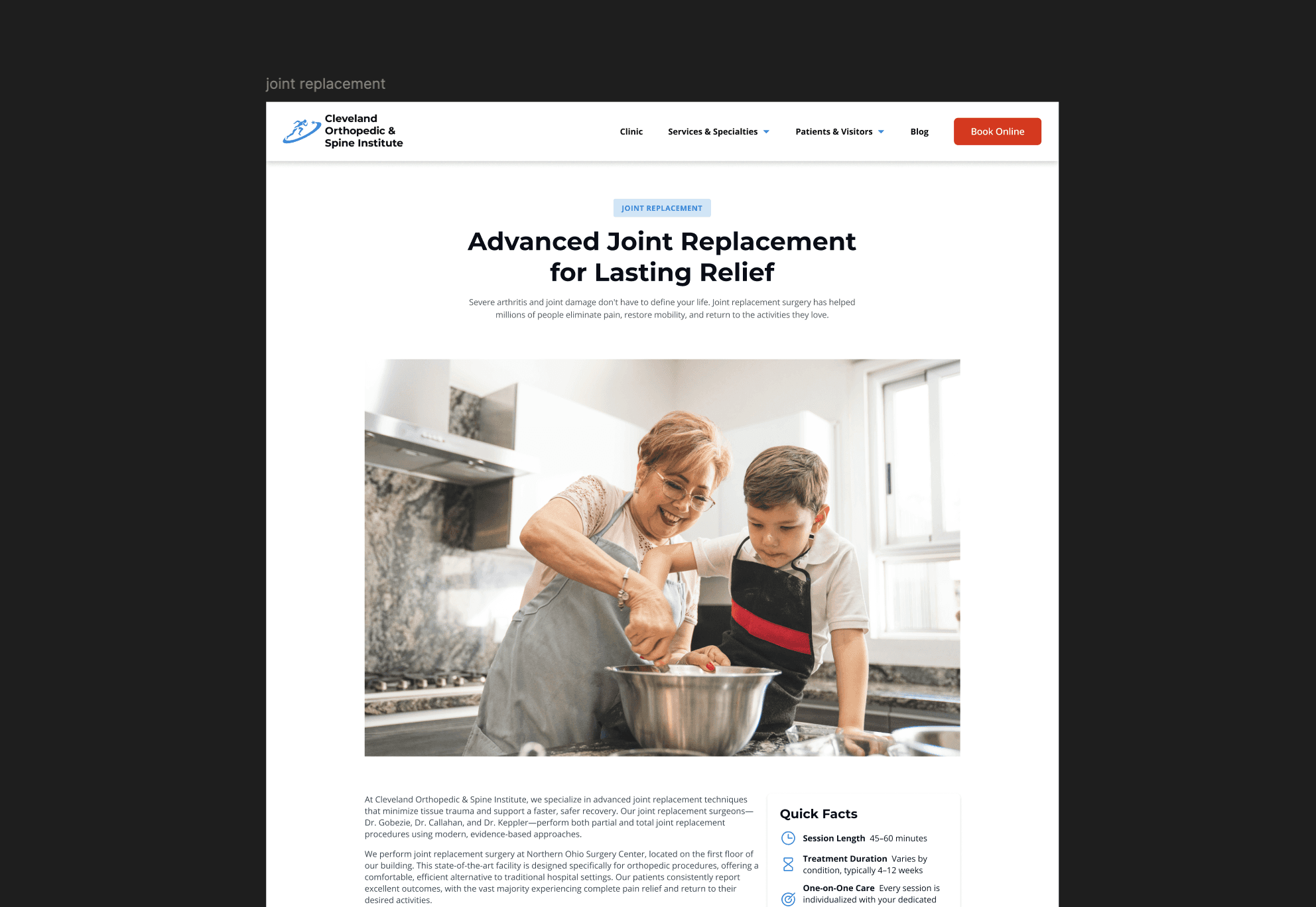
The comprehensive redesign plans to expand the site from roughly 20 pages to over 85 structured pages. Analytics revealed massive information gaps that patients were actively trying to fill. The 256% increase in Services page views after simply making existing content findable proved patients were searching for detailed information about treatments, conditions, and what to expect. The new architecture includes 28 core pages covering services, providers, locations, and patient resources, plus in-depth educational pages addressing conditions, treatment options, and recovery guidance. Each physician is receiving an individual page rather than being listed on a single directory, improving both user experience and SEO by adding their names and specialties directly to the site.
Content Expansion
In-depth content to support decision-making earlier in the care journey. Conditions, services, and specialties pages communicate expertise and improve discoverability by including common search phrases organically.
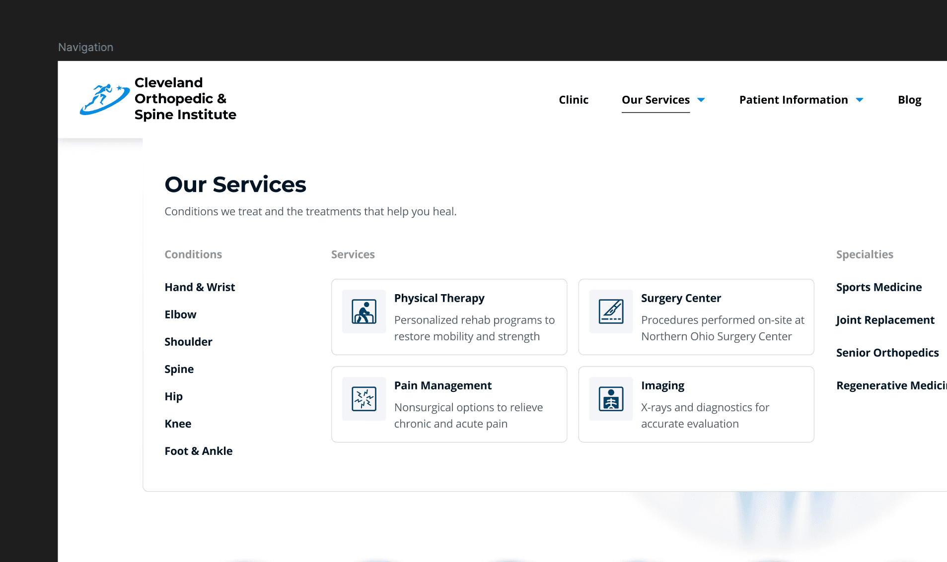
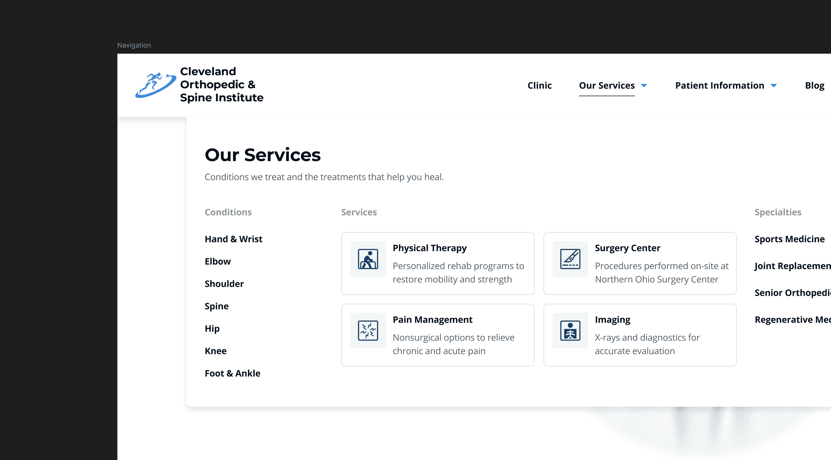
Advanced Navigation
I designed a mega menu to organize the expanded content. The structure maintains clear hierarchy while scaling to support a significantly larger content ecosystem.
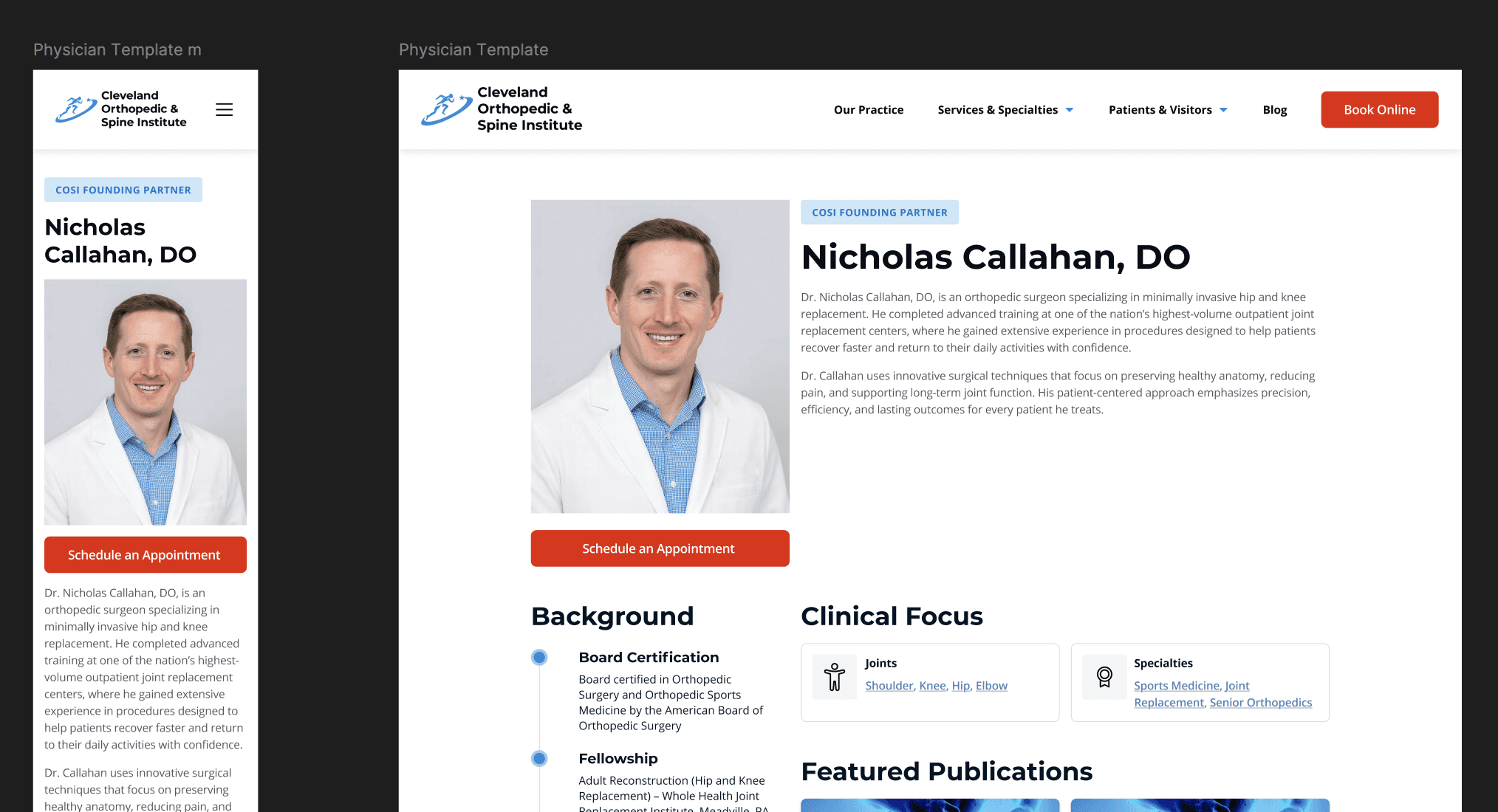
Enhanced Provider Profiles
Each physician will have a page outlining their specialties and credentials so users know who will treat them before they commit to scheduling.

Performance & Infrastructure
The site was optimized for performance and scalability through improved hosting, image handling, and caching strategies. These changes support faster load times for users.
What’s Next
The initial launch will focus on the highest-priority pages within the redesigned architecture, including the new mega menu, core service content, and enhanced provider profiles. This phased release allows the most impactful improvements to go live first, while creating a strong foundation that can scale as additional content is approved and published. Following launch, I plan to monitor site analytics and conduct short surveys and interviews with users to validate navigation clarity and content usefulness.
Looking ahead, future iterations will continue to expand educational content based on real patient questions and search behavior. Provider profiles will be refined using engagement data to optimize information hierarchy, and longer-term opportunities include integrating patient portal functionality for appointment management, test results, and secure messaging. Together, these iterations position the site as a flexible, user-centered platform that can evolve alongside the clinic’s services and growth.