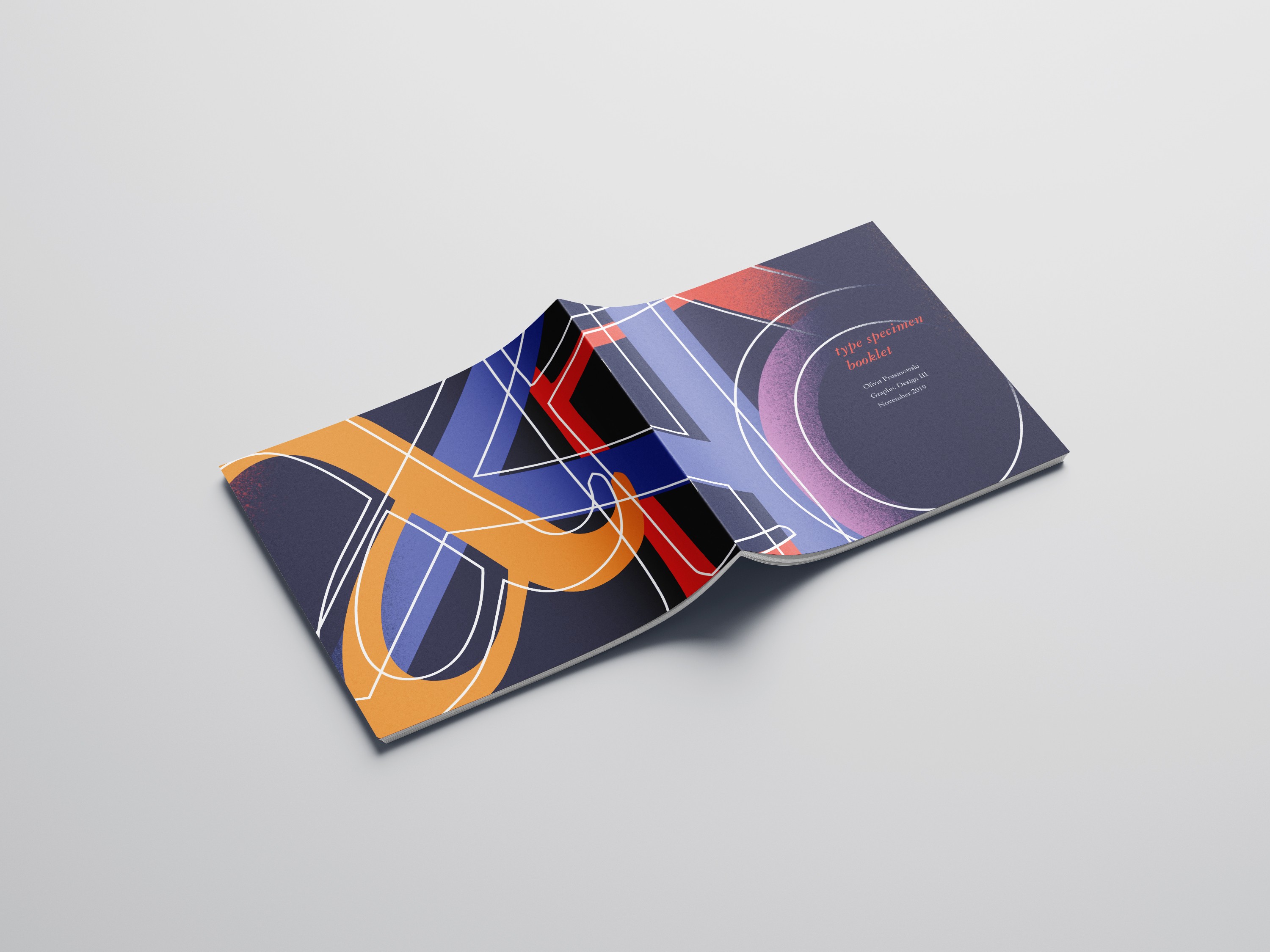
Garamond × Futura Booklet
A visual comparison of typography
YEAR
2025
ROLE
Graphic Design
TIMELINE
3 weeks
Overview
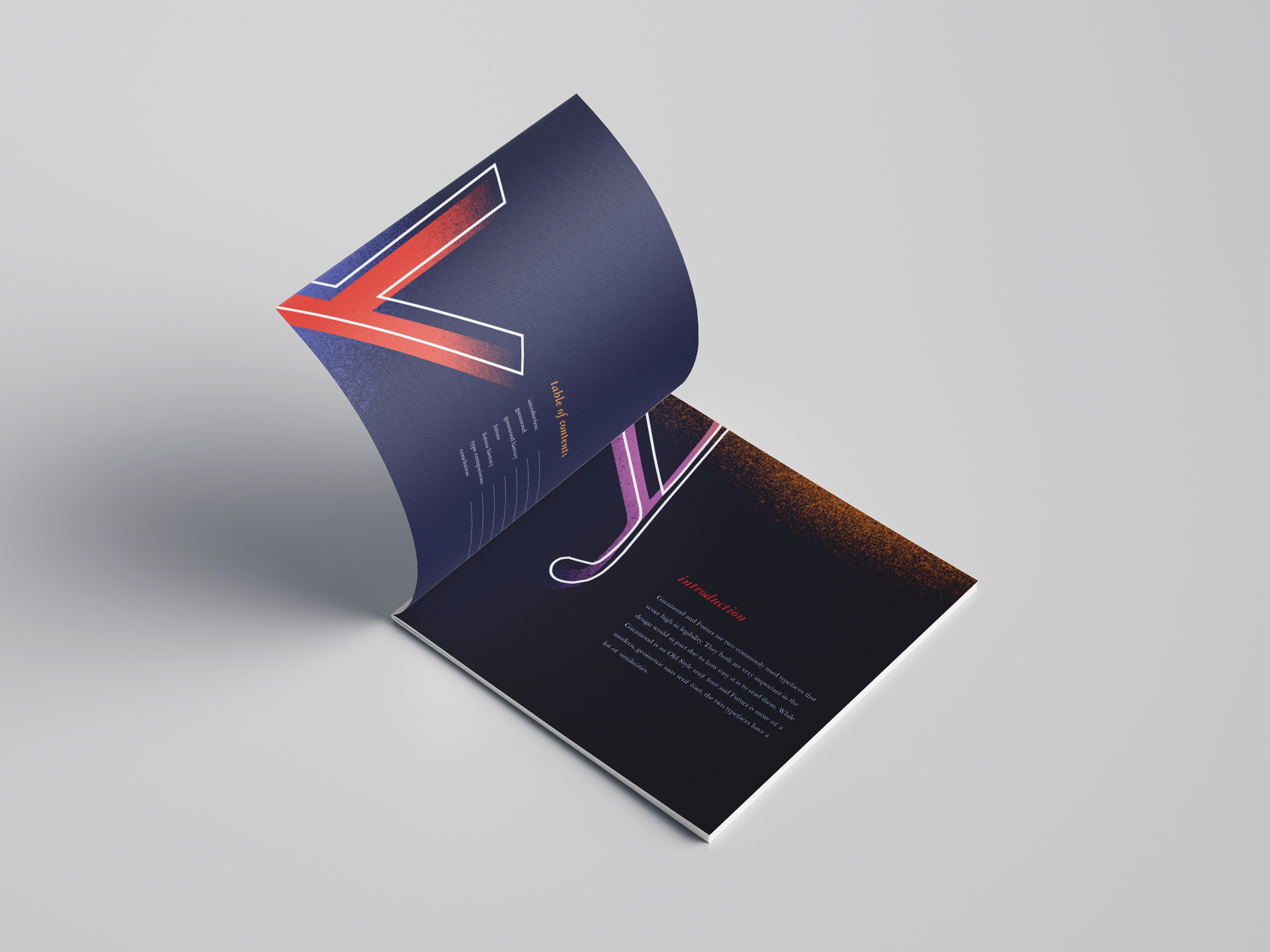
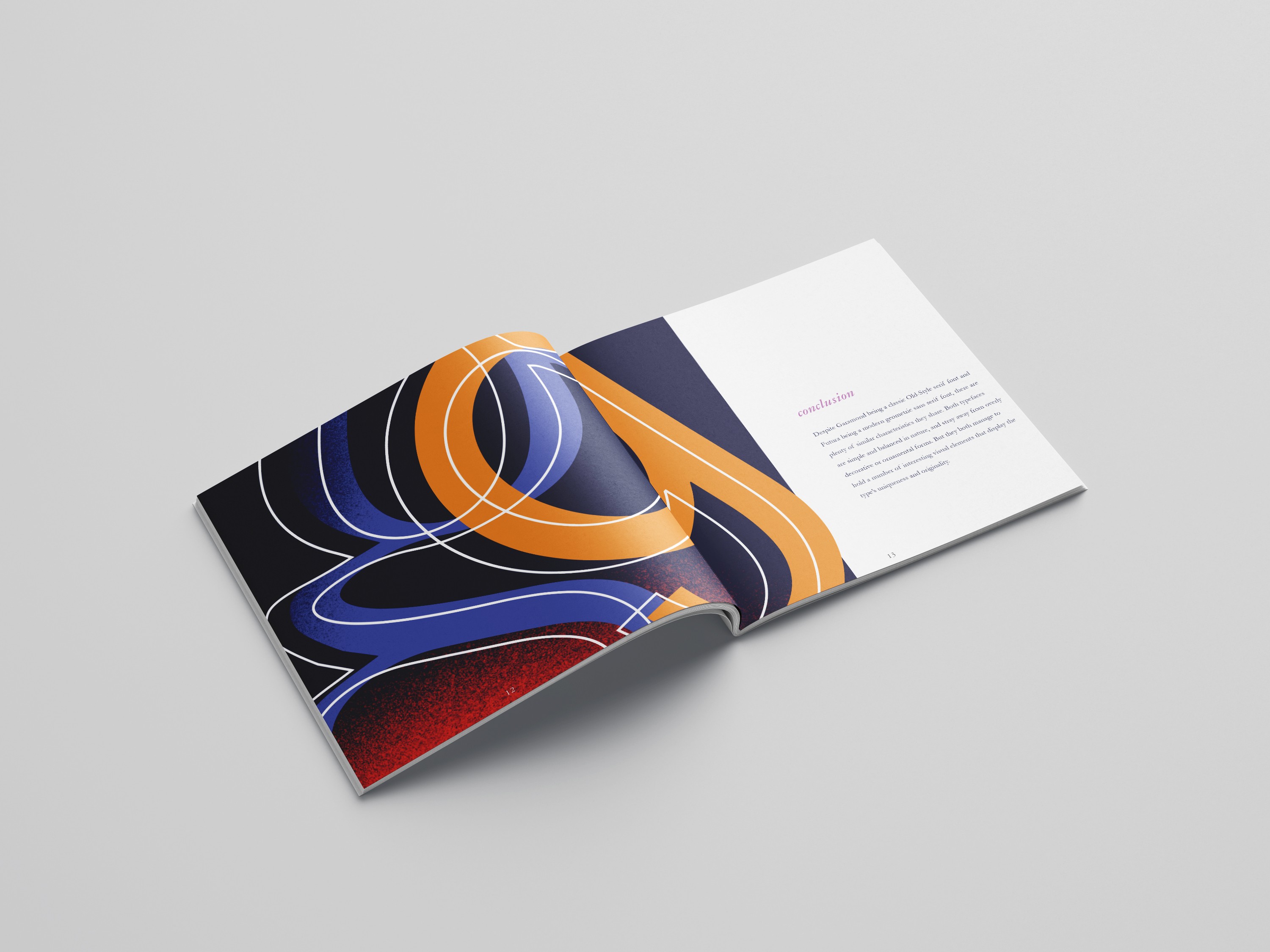
This printed booklet explores the formal contrasts between Garamond and Futura—two iconic typefaces from vastly different eras. Large-scale letterforms highlight each font’s distinct characteristics, inviting closer inspection of details in stroke, proportion, and structure.
Focus Areas
Serif vs. sans serif design principles
Legibility, usage, and visual rhythm in type
Practical comparison of body text vs. display text performance
Design Notes
Garamond: Elegant, humanist serif, ideal for long-form reading
Futura: Geometric sans serif rooted in Bauhaus ideals, optimized for modern display
Layout emphasizes large letterforms, white space, and minimal distractions to foreground typographic detail